The trending "Unexpected Red" theory: a decor trend that is really catching on
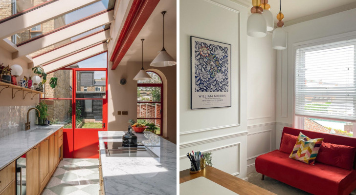
An interior design trend that went viral on social media platforms is now becoming popular in the mainstream: we are talking about the "Unexpected Red" theory. Not exactly new, social media has popularized this theory, which is considered to be the brainchild of Taylor Simon (@intayriors).
So, what is this theory and how does it relate to interior design? Well, keep reading to find out:
A red accent
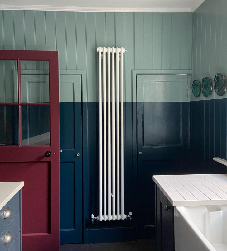
As the name of the theory suggests, "Unexpected Red" is about adding red details to the decor. Not exactly rocket-science, so why is this trend catching on? As a basic starting condition, all the colors of the room to be decorated in this manner must be free of red. Once this is the case, the introduction of a red, decorative element will be "unexpected".
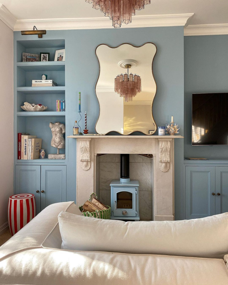
Even adding small, red details will be enough to create an eye-catching, attractive contrast in the room. Scrolling through the feeds of the various social media platforms, the posts grouped under the hashtag #unexpectedredtheory, show a majority of backgrounds in light, pastel blue backgrounds (as shown here).
A dramatic contrast
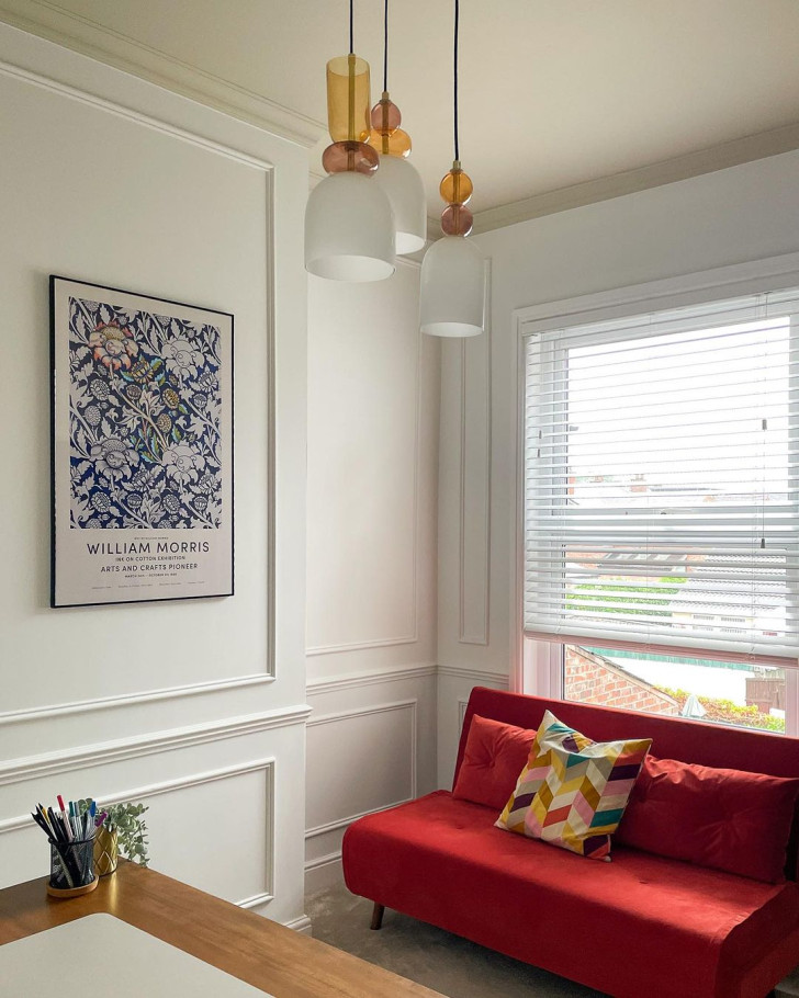
A dramatic contrast of the red works with any neutral background color, starting with white, very light beige, gray, but also black. What you need to get right is the correct shade of red that fits in without clashing with the rest of the room's color palette. The object chosen to be the one in red (or in striped red) will also have an influence on your choice (like the sofa, pictured here).
The most common elements to have in red
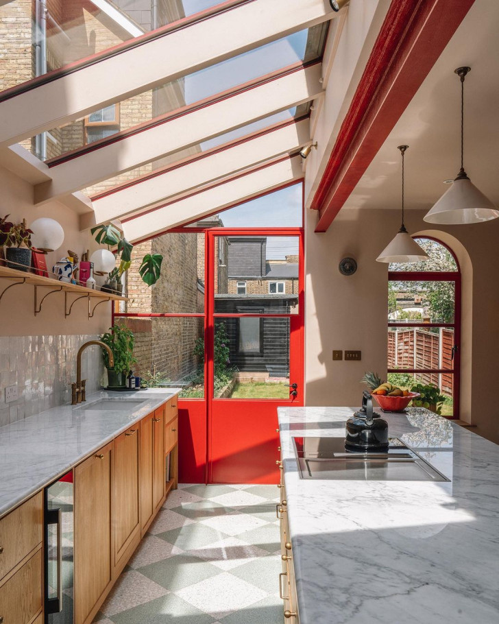
To implement "Unexpected Red" in your home, you can limit yourself to using red vases and other smaller furnishings (such as candle holders, trays, shelf ornaments, etc). Alternatively, you can be a little more daring and choose a shade of red for the window frames, bannisters or other prominent architectural elements (like ceiling beams, for example).
Entire sets of furniture
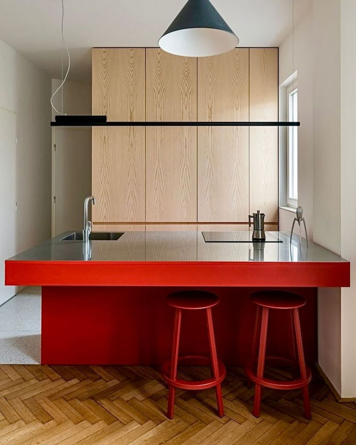
Depending on the type of furniture, a blaze of "unexpected red" can include an entire set of furniture - as shown by the kitchen island unit in this picture. A kitchen decked out like this will never be boring!
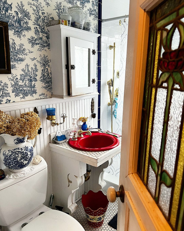
But this decorating theory also works well with single, smaller elements, as shown by the sink in the bathroom pictured here. The key is that the rest of the room must be decorated in colors that are not even close to red. So no oranges, yellows, pinks or purples as background colors.
The perfect strategy is perhaps to have easily-changeable/replaceable items in red (like chairs, mirrors, handles, for example) so, if you get bored with the look, you can return the room to its original condition with very little inconvenience.
