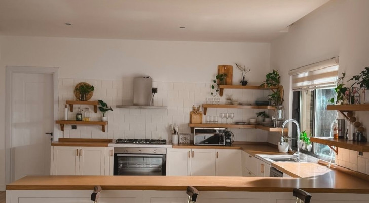
Why choose just one color for your kitchen decor when you can use two?
Two-tone kitchens may appear to be unconventional or unorthodox, but they are also absolutely fascinating - when done right, of course.
It all comes down to choosing the right two colors to use as the contrast. One is usually white - or even a lighter/darker shade of the primary color. But there are many options you can consider - keep reading!
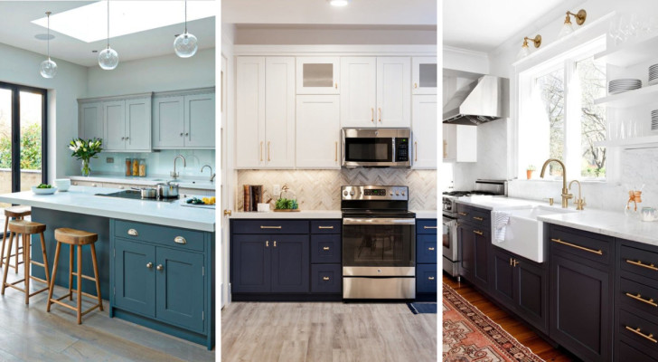
Two-tone kitchens: the most popular combinations are with blue
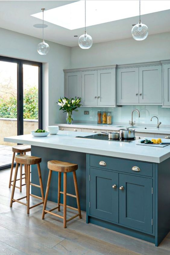
The best match for blue is white, and here is an example of how well a two-tone kitchen with these two colors works. Generally, in two-tone kitchens, the backsplash is done in a neutral shade to provide a "transitional space" between two main colors.
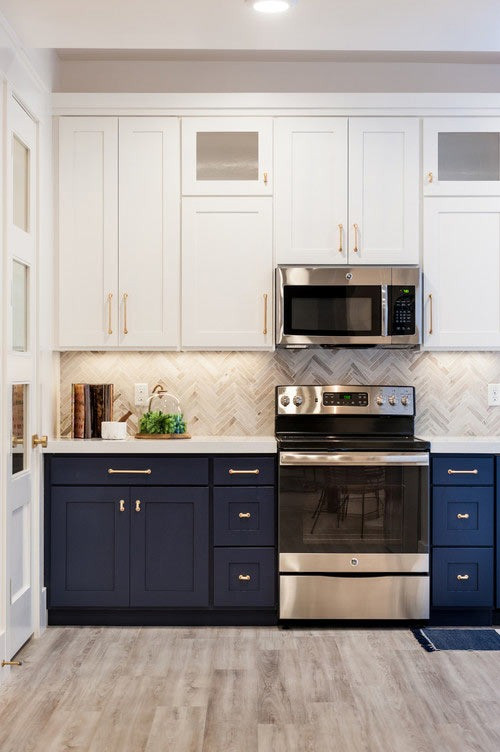
Generally, the darker color is used low down (and for the low-down kitchen units), while the lighter color is used on the walls and wall units.
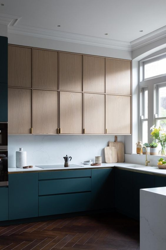
But what if you inverted this "rule" somewhat? In this case, the light color is used for wall units, while the kitchen itself (ie. the walls and the backsplash) is in white. Lower areas, as shown in this example, are a dark petrol blue.
Graduated shadings in two-tone kitchens
Here is an example of a kitchen that does not combine white with another color. Here, the approach is to use a graduation of closely matching - "related" - shades. The blue of the lower cabinets - moving upwards - turns into a very light, minty blue and is topped by the blue-grey used for the kitchen wall units.
Imagine doing the same with other colors: perhaps moving from black to grey, or forest green to sage green, for example.
An almost "hidden" two-tone decor
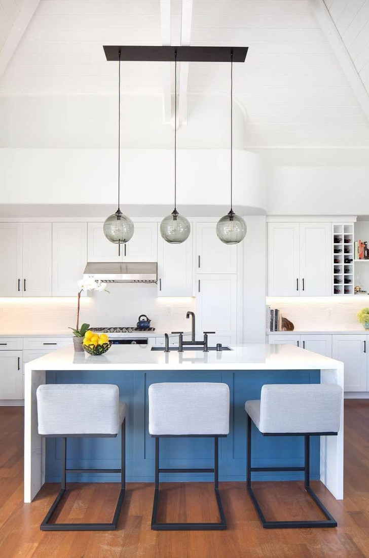
In this example of a kitchen with an island, the two-tone color scheme can be even less pronounced. Here, only a portion of the island itself has a dark contrasting tone (in sea blue); the recessed wall is framed in the same white as is used for the countertop. White is also used for the wall units and the other pieces of kitchen furniture.
In short, only a small "splash" of color (the sea blue) is used to liven up the expanse of white!
Two-toning works with all colors
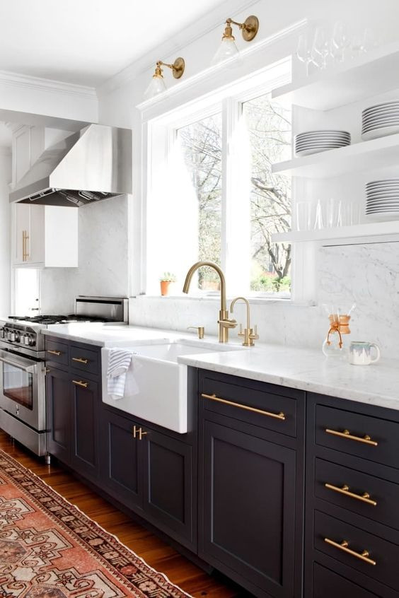
As mentioned above, instead of blue-white combination, you can choose other colors. Black or charcoal gray is another very popular option, and goes well with gold or brass taps and cabinet handles.
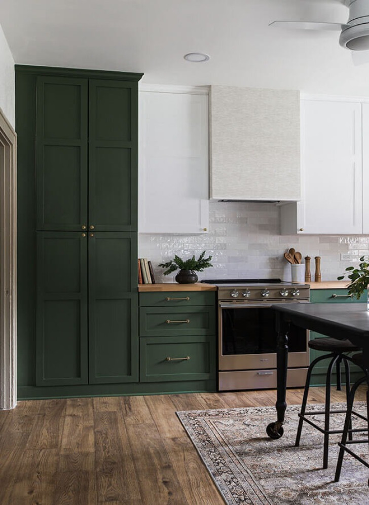
The same can be said of dark green and all the proximate shades it comes in. Elegant and relaxing, green goes very well with white.
And, as you can see in this photo, you can also "play" with the color division areas: instead of drawing an imaginary line that separates the two halves of the kitchen horizontally, it might be a good idea to give a little more space to the darker color.
What color combination would you like for your two-tone kitchen?