Seven stunning neutral colors to transform your home into an oasis of relaxation
It's nice to fantasize about how we could turn our home into something interior design experts would envy. But in reality, when we choose the colors to paint the walls or furniture with, we often end up opting for "safe" picks, i.e. neutral colors.
However, we can quickly get bored with traditional neutral colors - white, gray, beige, for example. But did you know that these neutral colors now come in a range of interesting and exciting shades, hues and tone? Discover some of these by reading on:
Skylight, by Farrow & Ball
Skylight 205 by Farrow & Ball is a very light blue-grey, mimicking the sky as seen from a skylight. This color is not very reflective and absorbs light. In smaller spaces, it appears cold, while on larger surfaces, it looks paler and has a grey tinge.
Skylight is an excelelnt choice for those who want to move away from greys, but without straying into colors that are difficult to manage. Skylight goes well with dark blues, whites, and also various hues of green, yellow and earthy/woody reds.
Modern Love, by Backdrop
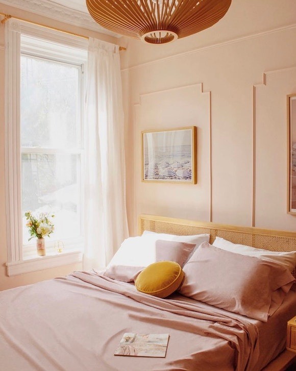
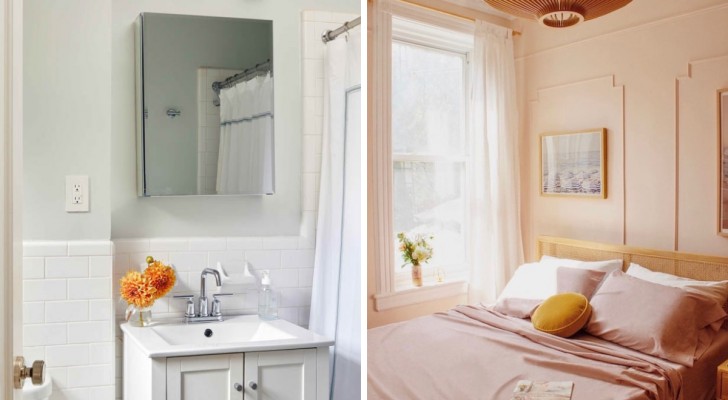
Looking for romance? Well, why not consider pink? This pink from Backdrop is light and has a gray undertone which tones the color down. It's a warm and welcoming color, which adds charm but without becoming overpowering: if you wanted to try a pink, this would be the one to go for!
Opal, by Benjamin Moore
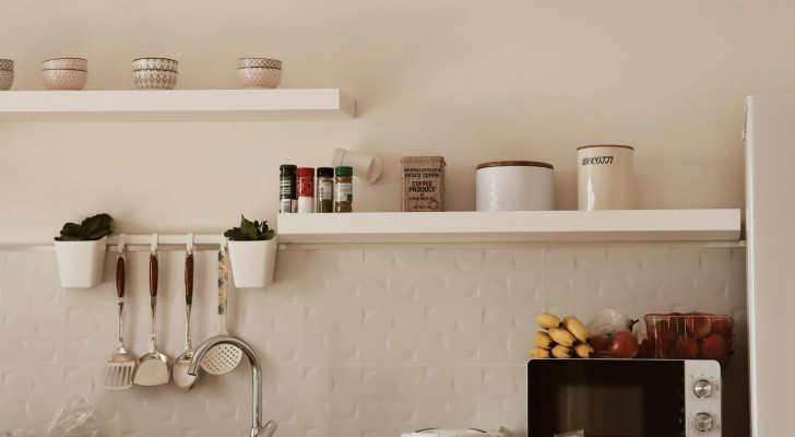
We remain with pink, but this time, leaning towards white: this is the color of Opal by Benjamin Moore. A non-white (or off-white) with a peach-pink undertone, which shines through in the right light.
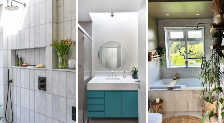
Chill, by Clare
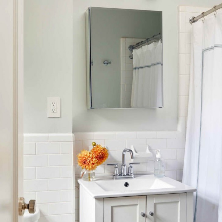
We remain on the lighter area of the color spectrum: Chill, by Clare, is a subtle gray, with a fresh green hue. Light, airy and relaxing this color is perfect for the bedroom or bathroom. Clare suggests it paired with white, but you could go bolder with greens, grays or dark blues as complements. Look at how beautifully this color complements the lively orange in the photo!
Breakfast Room Green, by Farrow & Ball
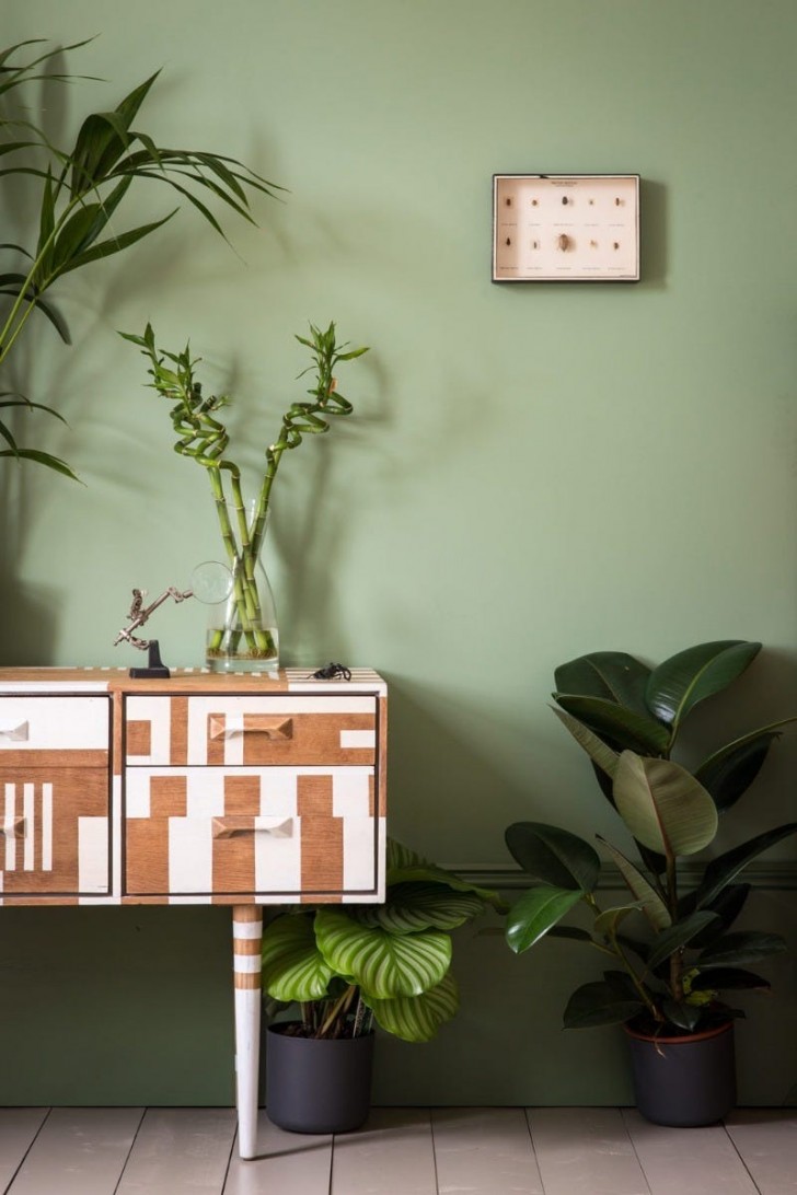
Breakfast Room Green is a bolder color than the others examined so far, but given that green tones or currently very popular, we could not leave this one out. For those who love colors that invoke nature, this is the perfect coloring. The manufacturers' description states that Breakfast Room Green remains vibrant in both direct sunlight and candlelight.
This color owes its name to where it is likely to be used, as stated by the manufacturer: "rooms that usually face east, designed for having the first meal of the day (breakfast), and is especially beautiful in dawn's early light". Are you already looking for this paint online?
Gray, by Benjamin Moore
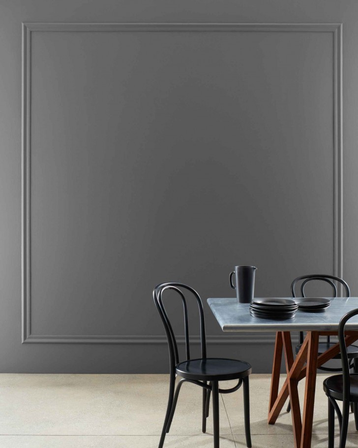
Color 2121-10 by Benjamin Moore is called simply, "Gray". The manufacturer describes it as: "a softer alternative to black, this rich charcoal color offers a very subtle hint of warmth." As can be seen in the photo, this color goes well with grey-blue, black, and a wood that has a slightly reddish tone. But it would also look good with light woods, and with white or soft, bright grays!
Creamy, by Sherwin-Williams
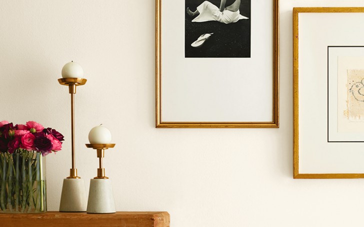
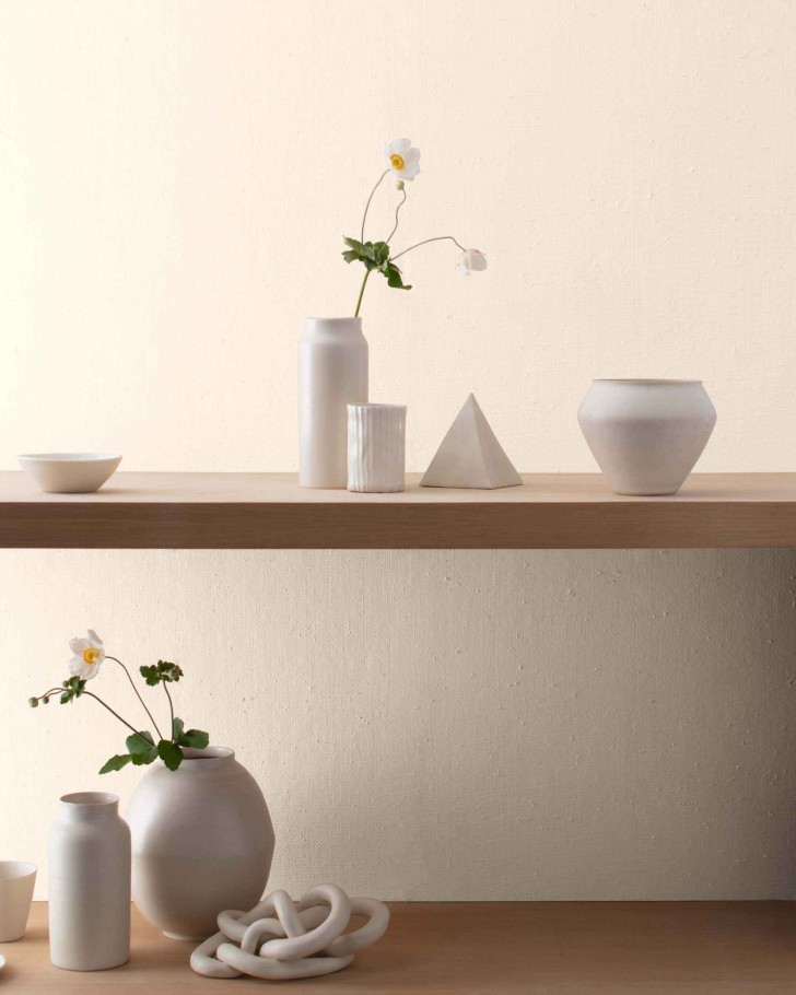
We finish with another alternative to white: this is called Creamy, and is a bright warm white with a very light yellow undertone which immediately makes any room more welcoming. This color is the perfect complement for furnishings in warm tones, such as ocher or dark browns. Wood and plants, terracotta and different types of stone also look wonderful against a Creamy backdrop.
So, how about using one of these colors for each room in your home?