Which colors to choose for your living room? Here are 14 proposals for amazing color combinations
You are about to renovate your home or have recently moved and need to pick out new colors for your rooms. How do you go about selecting the perfect ones? Many industry experts set about each year to discover and recommend suitable, fashionable color combinations. Regardless of your personal tastes, the objective is to create a welcoming, aesthetically pleasing, tranquil environment that is comfortable.
To this end, then, we'd like to share 14 great ideas to help you through this challenging, but enjoyable decision-making process. Still interested? Then keep reading...
1. Peach, beige and blue
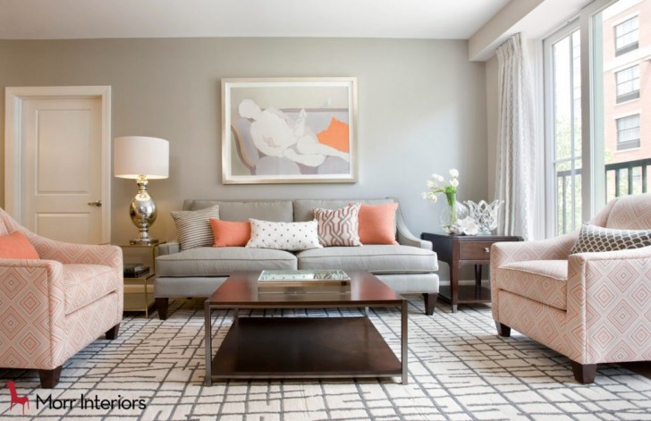
Subtle peach tones beautifully complement an elegant beige shading and a powdery blue that contrasts against the wall and the center sofa. Perfect for creating a chic and subtly stylish living space.
2. Dark green and beige
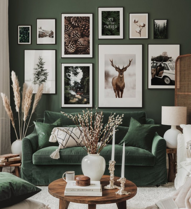
A distinctive and powerful contrast here, with deep green dominating the room on the walls, sofa, and cushions, while light beige adds subtle highlights throughout this forest-inspired decor.
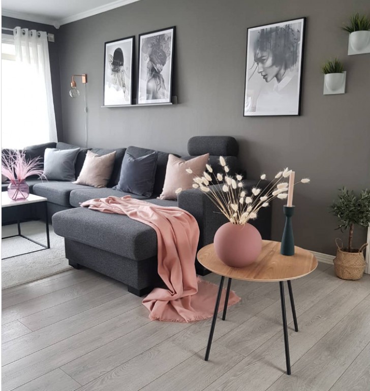
3. A grayscale with colored touches
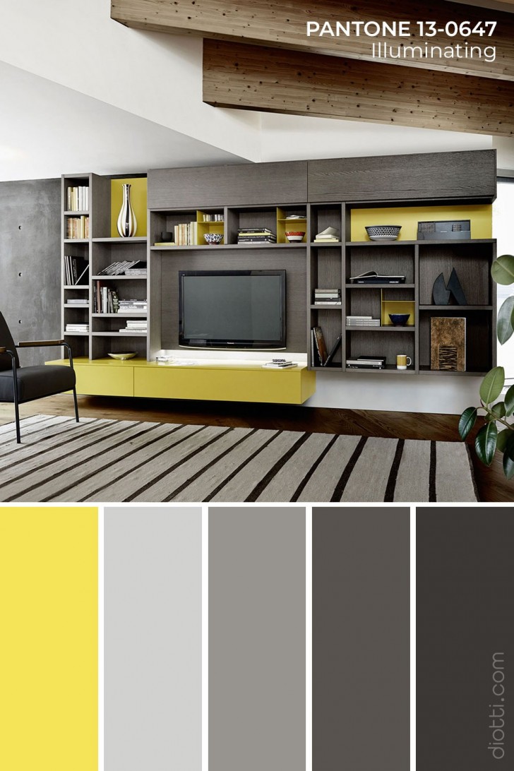
In a modern and minimalist setting, opting for a range of grays (grayscale) can be the perfect choice, allowing for the introduction of splashes of other complimentary colors. Just a single element can capture one's attention and wow your guests.
4. Color contrasts
The contrasting shades of a living room, evoking exotic and distant places, are ideal for feeling spoiled while relaxing on the sofa, getting lost in the pages of a book, or watching a good film.
5. Acqua-marine
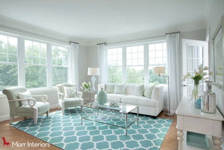
A palette of light and maritime tones encourages inner peace. Imagining oneself surrounded by a decor like this is like taking a journey through remote, Caribbean islands. It will feel like you're always on vacation.
6. Industrial style
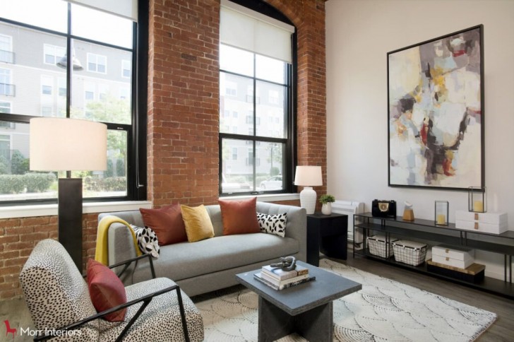
The combination of gray, taupe, and white tones harmonizes seamlessly, accentuating their beauty alongside the vibrant color of the brick walls. The distinctive choice of coordinating this specific color with the cushions on the sofas adds a unique touch to the overall color scheme.
7. Magenta and black
Bright splashes of color stand out against a black backdrop. Simply fantastic as a chromatic play of colors, not to mention the beautiful framing provided by the delicate elegance of gray.
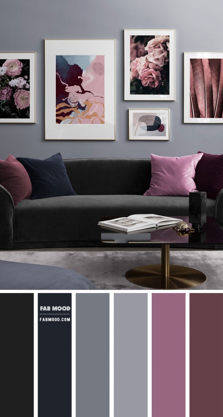
8. Dark gray and pastel pink
A bold and winning combination that the more daring can choose for their living room. It might seem almost "playful", but don't be intimidated by pink and embrace to create this wonderful look.
9. Green and white
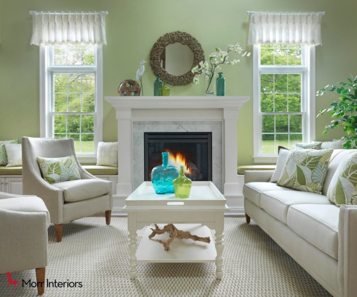
An arrangement like this brings to mind the fresh greenery of spring and instills a sense of relaxation at the mere idea of being barefoot in such a setting. Light and refined tones come together seamlessly in a blend of elements, moving from the wall to the sofas, then gracefully onto the leaves on the cushions and the greenery of the vase at the center of the table. And the plant in the corner is a nice finishing touch.
10. Colors that look like a painting
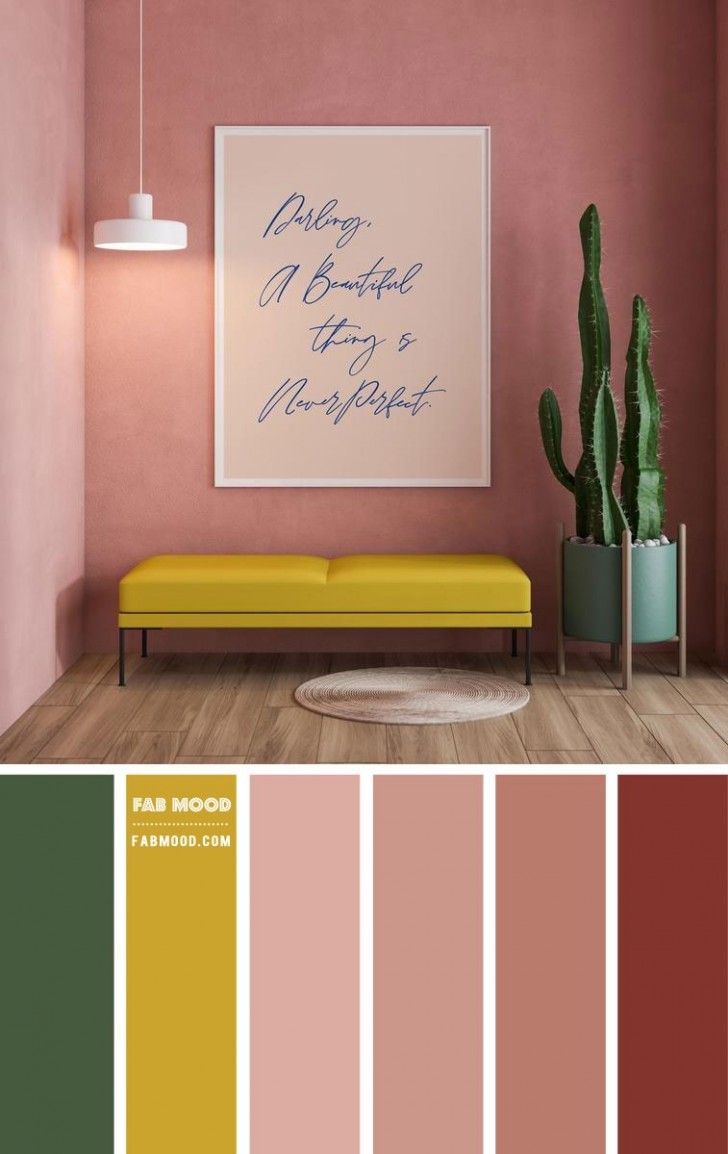
Choosing this combination creates a sensation of stepping into a work of art. It's an amazing blend of vibrant pink, yellow, and dual shades of green. Your guests are sure to be impressed.
11. A little bit of passion
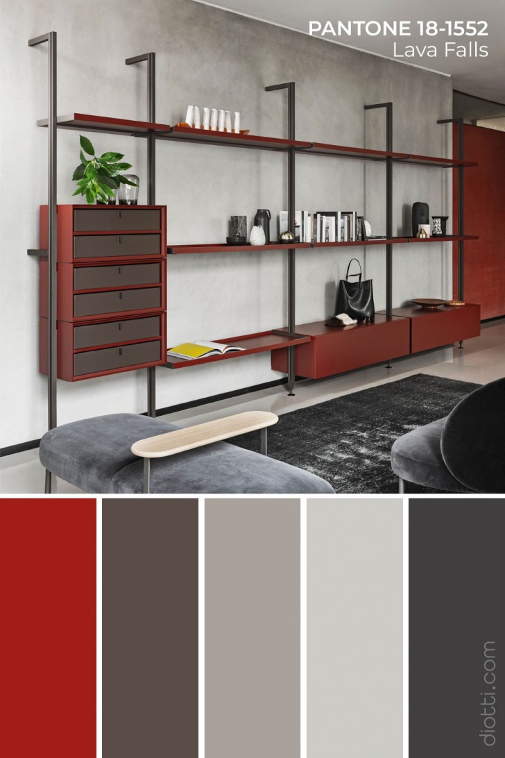
The various shades of red - be they light or dark - evoke feelings of love, passion, and intensity. So, individuals with a "fiery spirit" may find these colors ideal for their living room. When combined with grays and black, they will make for a beautifully sophisticated and minimalist mood.
12. A touch of class
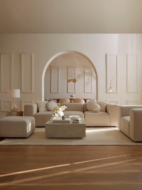
Clarity, purity, and a sense of anticipation defines an environment that embraces you, providing a haven of relaxation. The luminosity reflects the light, filling one's senses with joy and peace. Anyone in search of elegance, will inevitably be drawn to this intricate blend of colors.
13. Desert shades
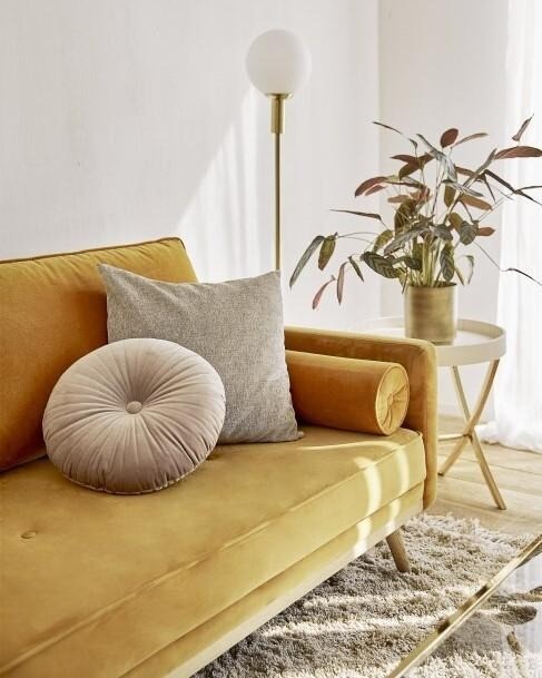
Perhaps you love traveling and discovering new places, and have a particular fondness for desert landscapes which are characterized by vibrant oranges, yellows, golden undertones, and shades of sand. This is exactly what this color palette will bring into your home. Once decorated, you wouldn't dream of changing it.
14. At the bottom of the sea
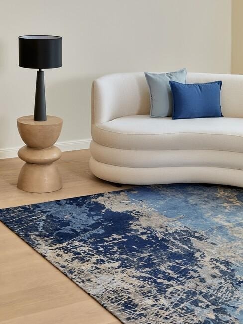
Blue, white, light blue, and azure – a combination of colors that harmonizes perfectly with the natural look of the wood - not only the parquet, but also in the stand supporting the lamp. It's a bold and genuinely unique pairing.
So, with all these possibilities, how do you make a choice? The answer lies in following your personal tastes, allowing these factors to guide you towards a decision that best reflects who you are and what you want.
All that remains is to wish you... good luck!