What colors to choose for the living room? Be inspired by these beautiful and relaxing color palettes

The living room is the space we associate most with relaxing evenings, lazy weekends, and unwinding. We also welcome guests here or spend hours doing the things we like most when we need to take a break. So making the living room a welcoming oasis of relaxation is an important objective when planning its furnishing. And this result is also achieved by the colors we use when furnishing it.
We are not just referring to the paint on the walls or the coloring of the flooring, but to all the details that will be in the field of vision. This is why it's important to decide not only a main color used, but also on the complementary shades that will be used for the furnishings. So, given this, let's talk about color palettes:
An intense blue living room
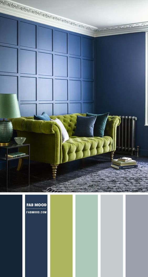
The color for 2024 - according to the paint company Benjamin Moore - is Blu Nova: a deep and warm blue that borders on violet. The picture shows something close to this: the blue is slightly more electric, but still creates a wonderful background, which pairs beautifully with the lighter tones shown in the color palette. To brighten things up, the contrast with chartreuse green is perfect!
A wide choice, from dark petrol green to very dark plum
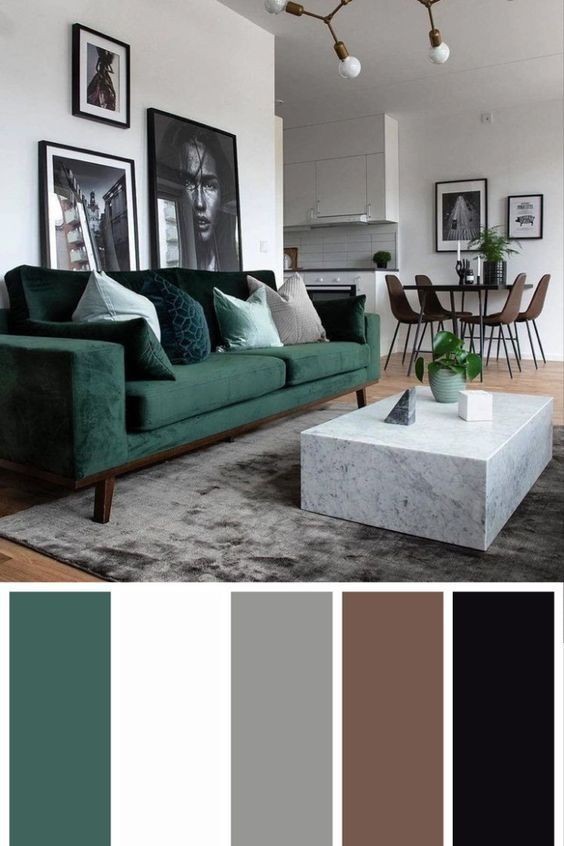
Here, the palette offers two dark extremes within which more delicate shades can be combined. Lots of choice is available then for the elements that will stand out against the background of lighter shades.
Every time you choose a color palette it is important to pay attention to the light in the room: you must make sure that the light does not alter the perception of the chosen color, but rather enhances it!
Warm earth tones in the living room
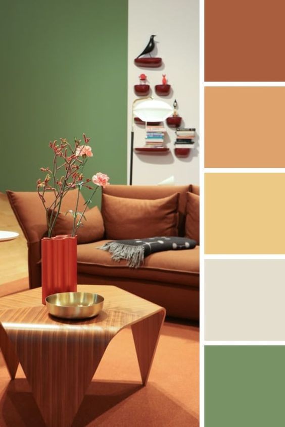
Do you prefer to be inspired by a sunny landscape? The reddish color of earth, light green trees, and lighter tones in general are your thing? Here is a color combination to guide you in this vein.
The neutral living room with elegant undertones
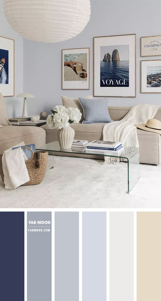
When we think about neutral colors we don't have to limit ourselves to white, beige or gray. We can also "move the cursor" a little towards lilac, wisteria and light blue. Find a point halfway between the two extremes, which isn't saturated, and you get all the color combinations you see here.
Spruce up the living room with some pastel colors - but don't overdo it
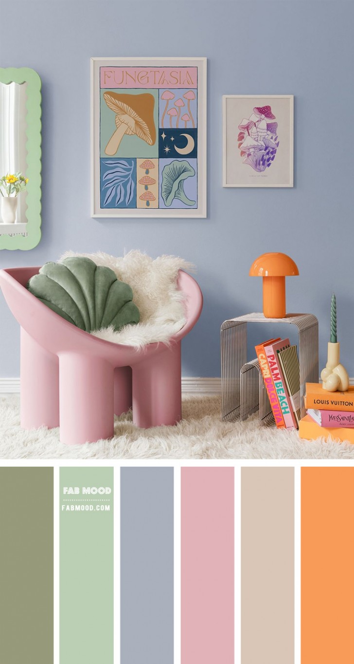
If you think that bolder colors might get boring in the long run, then consider a palette like this one, which has a relaxing background color on the walls, but which leaves room for delicate pinks and oranges for the furnishings
A neutral living room with subtle shapes in dark grey
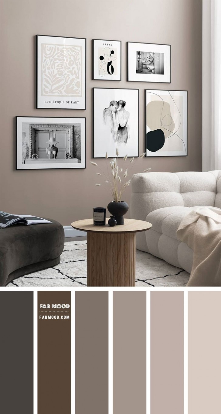
Staying with a living room in neutral tones, a gray base that shifts imperceptibly towards lilac, is the perfect backdrop for a modern, relaxing environment.
Passionate for purple? There's room for this too in a living room
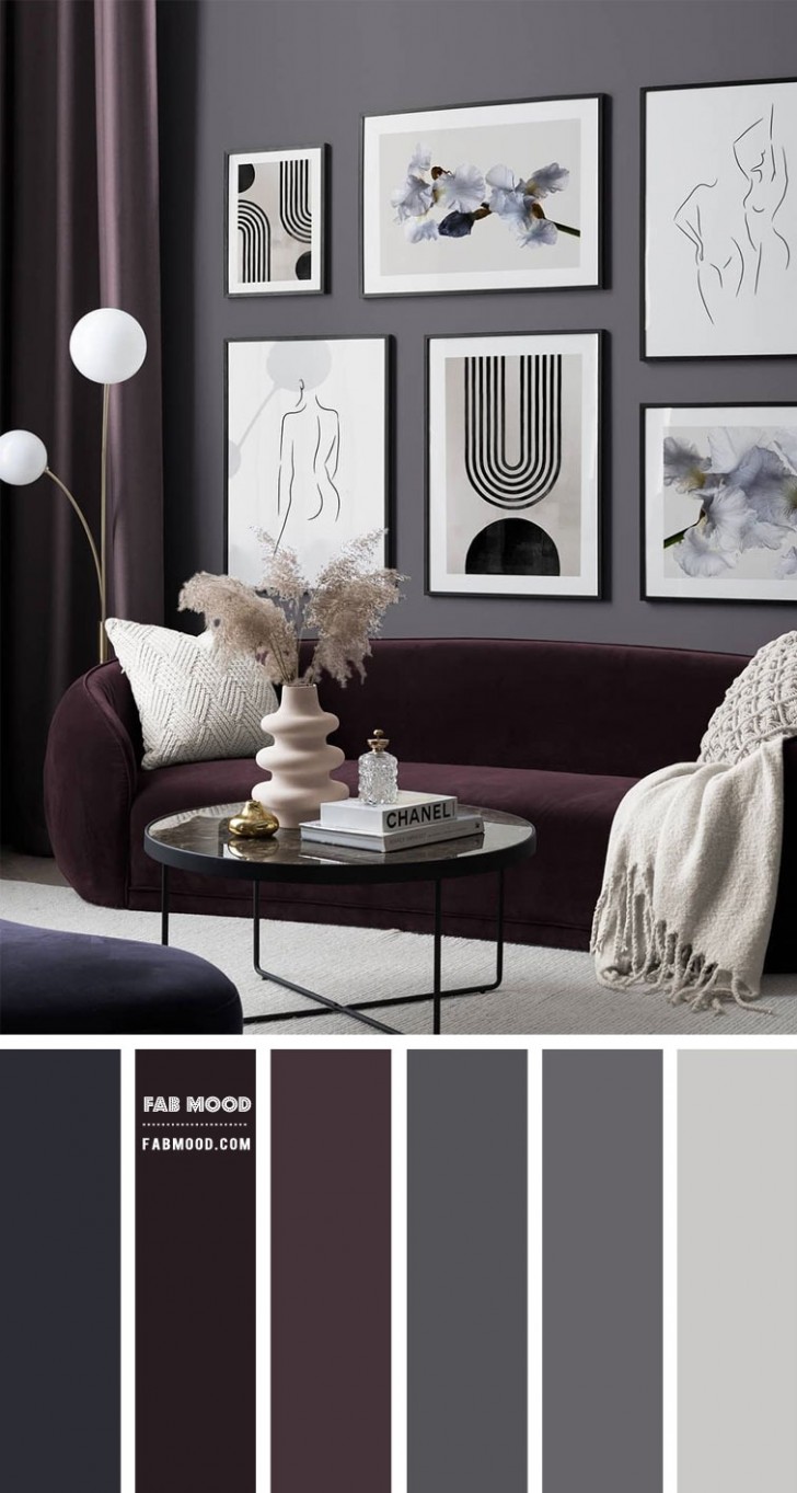
Some love it, some hate it - but purple is popular with many. A combination of shades like those highlighted by this palette, for example, is certainly relaxing and does not sacrifice character.
The discreet elegance of sage green
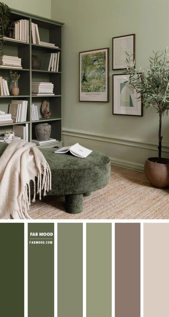
A color that has been used in domestic environments with elegance for ages is sage green. From noble living rooms of the past to modern homes, sage green is a "wild card" that allows for a thousand color combinations. For a calming palette, it can be combined with very light beiges, terracotta or desaturated plums (and there is always room for a slightly "dirty white" too).
Which of these color combinations suits your tastes best?