Beyond a fail: when design errors are so bad, they are almost good
Anyone can understand wanting one's home to stand out. But sometimes, in fulfilling this wish, there are some individuals who go just a bit too far.
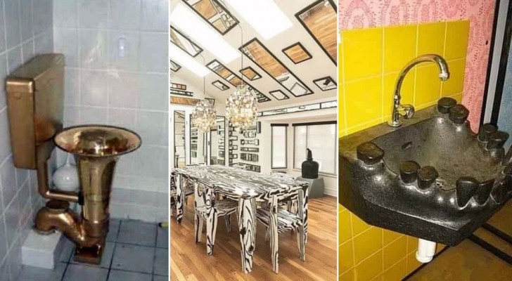
What follows is a gallery of, let's call them, "questionable creations". But honestly, we lack the words to describe what these things really are. Take a look for yourself and see what "human ingenuity" (and a good dose of bad taste) is capable of producing.
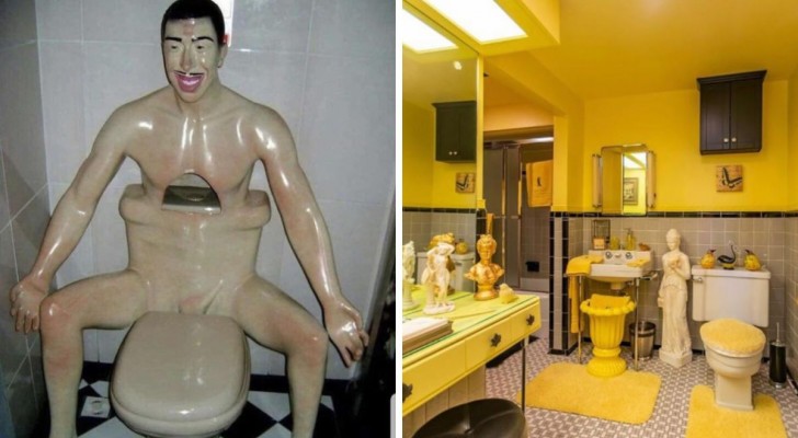
Here's a strong start to this article. One user commented: "What an awful time to 20/20 vision." And how can we blame them for saying so?
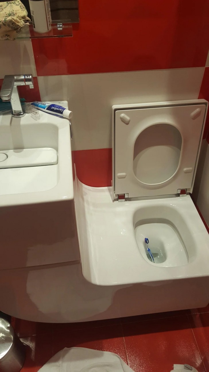
The toilet is connected to the sink by a slide, and the toothbrush has used it!
When bored, you can always put pigtails in/on the stairs. And it must be really easy to keep clean!
There are those who dream of a loo that comes with all sort of modern tech. Then there are those who choose the comfort of a bygone era instead. A wannabe Sun King, perhaps?
A completely marbled kitchen, to make you feel you're inside a meat grinder.
The loo may be in the corner, but we challenge anyone to say that it is not prominent. Accompanied with disco music from the 70s, this would be a masterpiece.
Another example of "cleverly exploited" corners.
A staircase that begs just one question - why?
What's the occassion? When going to the loo is almost ceremonial...
If "accident prevention" were a ladder, this would not be it.
Desperate times call for desperate measures. Taking a bath here could be the last thing you do.
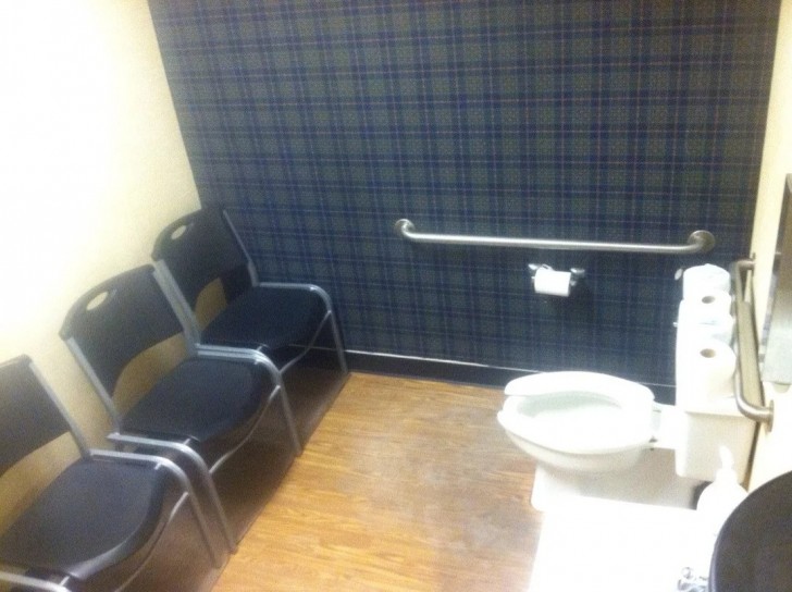
What on earth happens in this home when someone uses the loo? Is it a spectator sport?
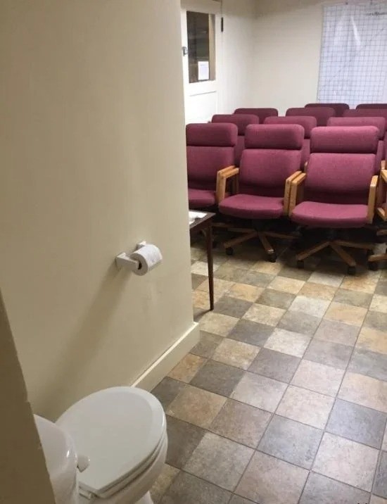
And if you thought it couldn't get any weirder, here's proof that you're wrong.
And we close with a little "sobriety" in deep yellow.
Well, at least they tried...
