Furnishing horrors: 13 times in which the drive to be unique has produced... questionable results
It is not always easy to choose the right furniture, fixtures and fittings for our homes: without some guidance from those "in the know", one could wind up making costly mistakes.
Clashing paint colors, a chaotic mish-mash of loud patterns and decorations, and more: these are not the ingredients need to create a relaxing, bright and balanced environment. And one would think that it would be difficult to make blunders like this. But examples abound and below, we show you some of these furnishing horrors:
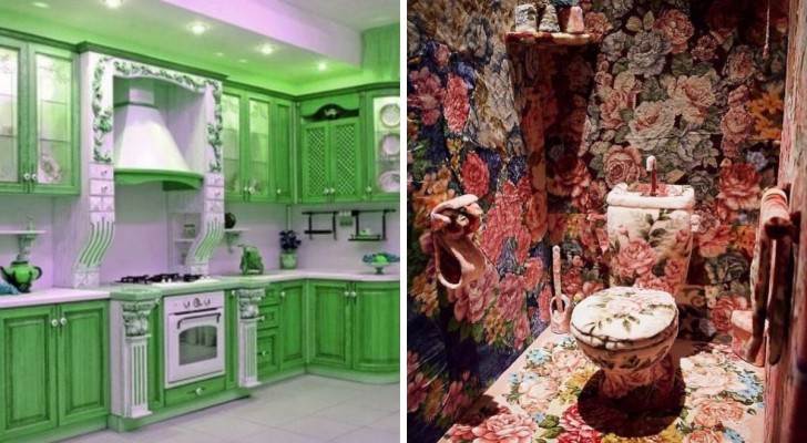
The shades of green tea have inspired this painting trend - which is gaining popularity recently. Hopefully, the trend will quickly go into decline!
Here's another kitchen, painted in colors which, we are sure, the owners will regret using in short order.
When 90s-style patchwork makes you cry, rather than feel nostalgic...
Maybe this is a way to deter people from walking barefoot around the house.
For all those who dream of a home that is as exciting as a crime scene. #Dexter.
With stairs like these, there will be no caution other to "not run down the stairs". But undoubtably, someone will try.
What can be said about this "unique" room? Furnishings and decorations which are decidedly sui generis.
Unless you live in Willy Wonka's mansion, a floor like this will probably end up giving you a migraine.
A truly fascinating sink - until you have to use it, of course.
Well, at least they got the floral patterns properly coordinated and distributed throughout.
When the kitchen wants to look like a sofa or a padded cell.
Loving the nautical style doesn't mean having to encrust the toilet with sea shells...
Perhaps, when the curtains are opened, this room is flooded with light and no longer feels like a floral cave.
What do you think of these design choices?
