9 cases where the design of objects will pleasantly surprise you
Who among us does not love useful or well-designed details in the objects we buy, no matter whatever kind they are? Certainly, there are times when you can or should overlook some features in favor of price, but when these features are present on commonly used items, they can be a pleasant surprise. As a result, we end up appreciating something more than we thought it would.
It is a bit like the philosophy of trying to appreciate the small pleasures of life, but, in this case, applied to the design of common objects. Below, we describe some features web users have found and who were pleasantly surprised by these so-called "easter eggs" (i.e. unexpected surprises).
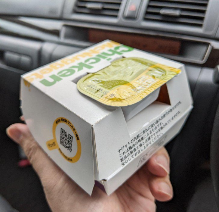
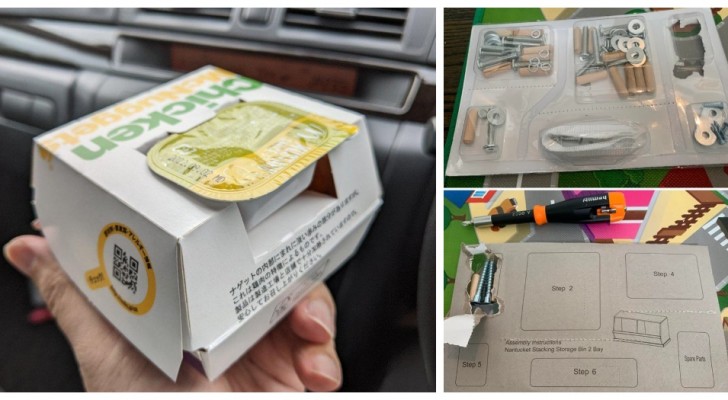
Here is a box for a McDonald's burger that has a compartment for a single-serving packet for one of their seasoning sauces.
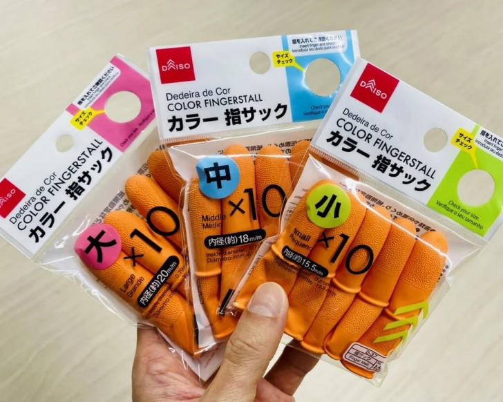
Finger covers / protectors for those who browse documents or count banknotes, and who want to avoid painful paper cuts to their fingers, these packages have a hole in the size of the enclosed protectors to show if the size of the contents are suitable for the buyers' fingers. This is truly brilliant.
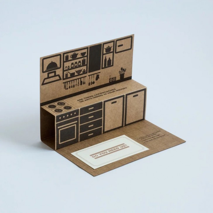
This is the business card of a pest control company, which also acts as a trap for cockroaches!
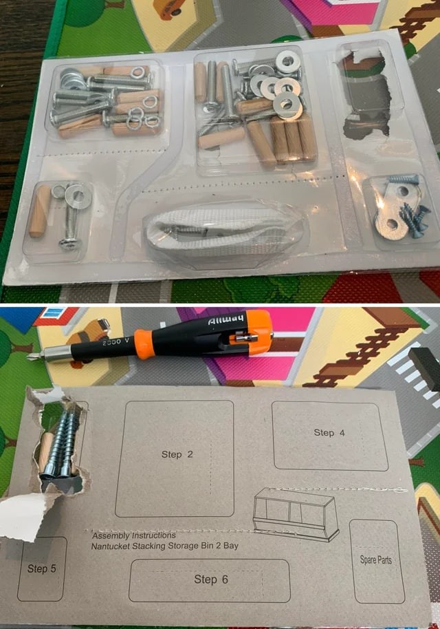
Who wouldn't love a box that shows clearly how to use each part of a kit?
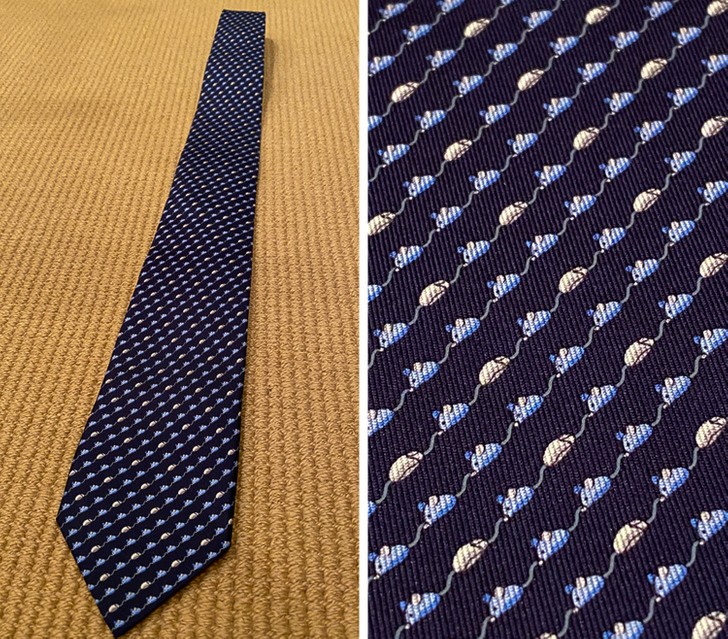
At first glance, this is an ordinary tie with a very minimalist repetitive motif, but looking closely there are many rows of "mice": both depicting the animal and of the tool that we use for computers. In English, in fact, this word ("mouse") can mean both!
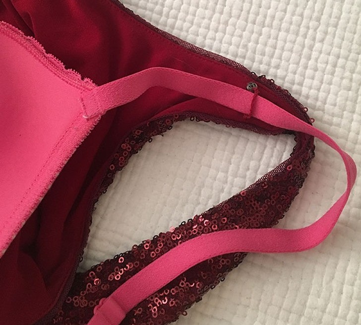
The suspender of this dress has a small loop to which the bra strap can be secured: it is an invention that should be added to every outfit!
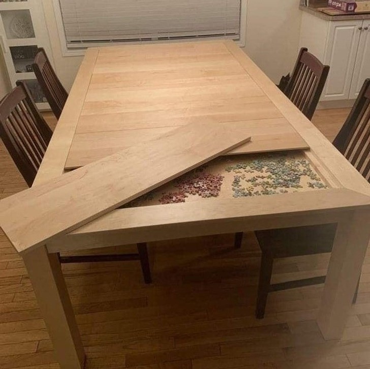
Here's an idea that also can be done as a DIY project: make a secret compartment under the tabletop, to use as you wish. The important thing is also to remember to open it up and clean it periodically - otherwise it could contain some unexpected surprises!
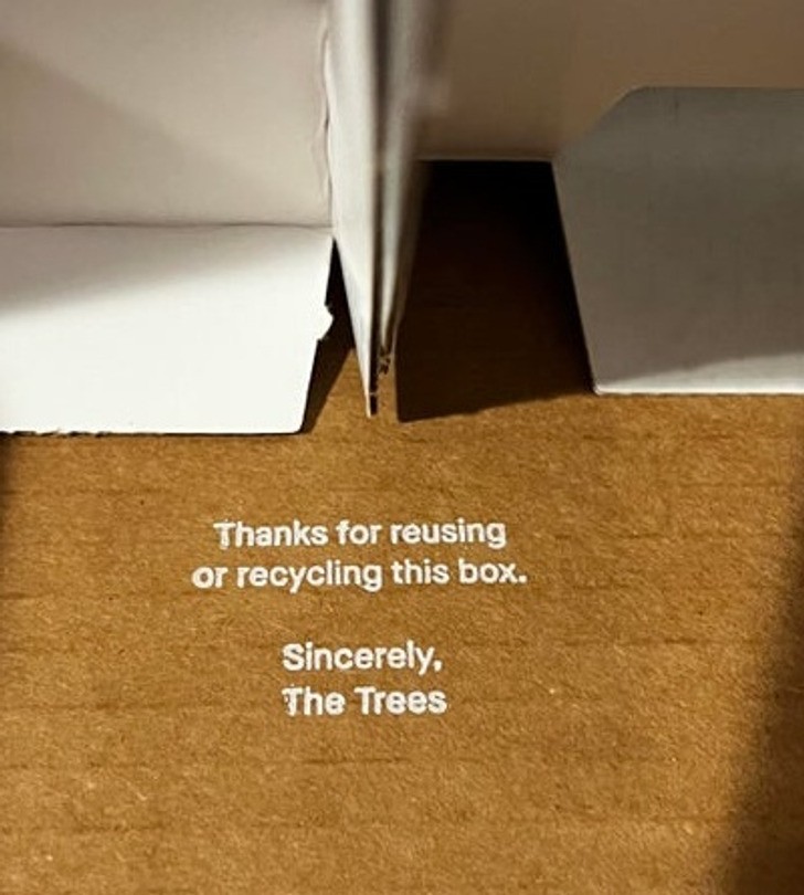
This is the message printed on the bottom of a shipping box: "Thank you for reusing or recycling this box. Sincerely, The Trees".
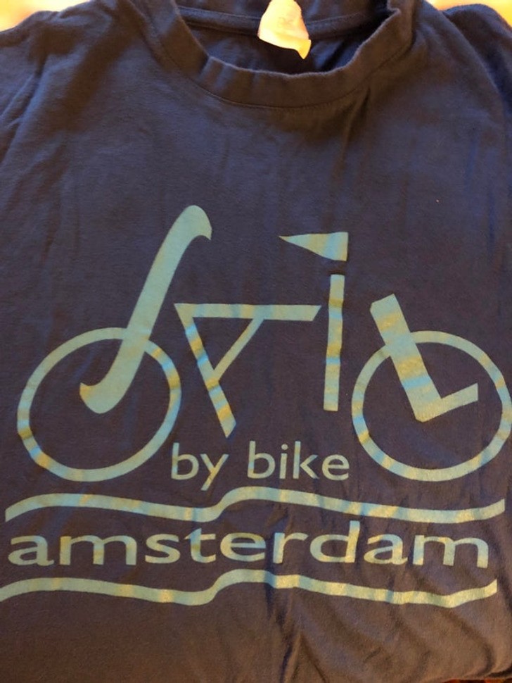
There is something very satisfying about a logo that combines its readability and effectiveness of its message in a pleasant and clear image. This T-shirt encourages you to use bicycles to travel around the city of Amsterdam, and it does so with an inscription that says "Sail by bike", and the word "sail" forms the shape of a bike!
What are the most brilliant examples of designs that have come across?
