The most common mistakes to avoid when furnishing the home
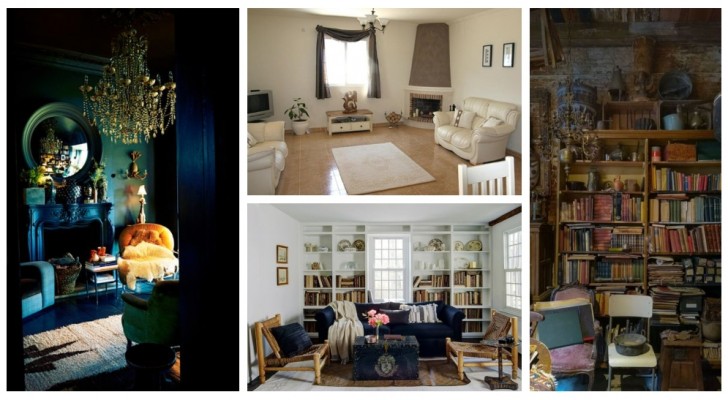
Choosing the furniture for a room, from the colors of the walls to the furnishings, is a matter to consider calmly: the first rule is to be patient and think about everything we need in each environment, and then select the respective elements that reflect an unique, aesthetic style.
While doing this, however, you must avoid running into some of the most common mistakes that are made when furnishing rooms, such as those that we detail below:
Cluttered furniture
Perhaps you are an admirer of the trend that online is known by the English term "clutterbug": it is the interior design idea born on TikTok that celebrates the aesthetics of rooms full of objects - a real jumble of accumulations of items of every genre, perhaps even stacked on top of each other in a precarious manner... All this disorder is not a goal to be pursued: therefore try not to fill every available surface with too many trinkets, objects and accessories, as well as decorations and knick-knacks.
A mass of objects crammed everywhere creates a visual eyesore which in addition to being (for most, at least) aesthetically unpleasant, can also be oppressive on a psychological level, making the room less pleasant to live in.
Clashing colours
The combination of colors, and at the same time, the choice of the types of material that we will see as the focus of aroom, is very important: both with regard to the surfaces of the room (floor, walls and ceiling) and for all the furniture and accessories of the room. We tend to recommend staying within a combination of three shades, to be distributed in a "60-30-10" proportion. This means that the prevailing color (usually the lighter one) will cover 60% of the visible surfaces, the medium one (a neutral tone and complementary to the first one, usually) 30% and the contrasting color (often dark or in any case more lively or saturated. ) the remaining 10%.
Obviously, there are other possible proportions as well, depending on the size of the room, its shape, and the style of furniture, but there is a good reason that the 60-30-10 rule will serve you well!
Layout of the furniture
Putting all the furniture against the walls and leaving too much space in the center of a room is wrong, especially in large rooms. As well as not distributing them harmoniously, but mostly grouping them in one point can feel claustrophobic. Space must be left to move easily about the room, and without an obvious disproportion between the free and occupied areas.
Colours too dark
Dark room, dark mood: it's a well-know adage that everyone knows, but it doesn't just mean we can't choose black or deep blue to paint areas of our rooms. Indeed, perhaps it is even desirable, but only under certain conditions and within certain limits. It all depends on how much of the room will be covered by the dark colors, and even more on how much natural light enters it, and how the artificial lighting is also going to be managed.
Basically, dark colors, but also flashy patterns or shades that are too bright or too dull, tend to absorb light or distort the perception of space, making it seem smaller and more oppressive.
Clashing styles
Managing an eclectic furniture style is a challenge for those who really have a very fine eye, so if you are not sure you know how to mix different styles, try to use furniture with compatible models - or at least look for a uniformity of lines and materials.
Disproportions between room and furniture sizes
Small room, big furniture? Unfortunately not a great idea. A sofa that takes up too much space and leaves the rest of the room bare (unless you really like it that way) is a mistake that can only be remedied with ... a replacement (smaller) sofa. Always think about everything that you believe is fundamental in a room, in terms of furniture, and try to combine the models and styles for each piece and have the minimum space available to allow you to deploy everything without cluttering the room too much.
It is worth studying all the possible combinations a little bit to get to realise a house that reflects our tastes, but that is in fact also harmonious and livable, right?
